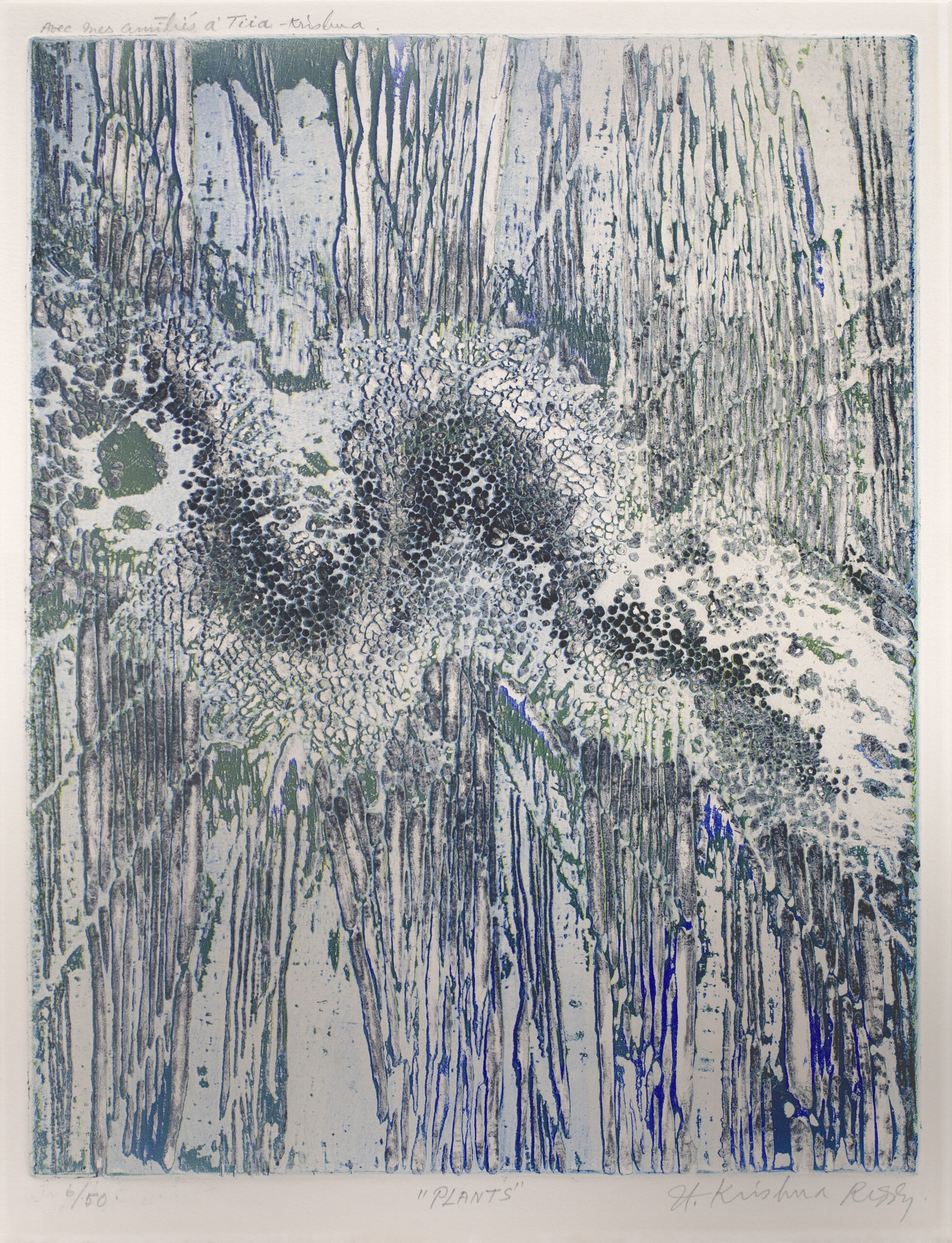
Color has always been more than a decorative element in art. It shapes atmosphere, directs attention and often carries emotional or cultural meaning within an image. Across centuries of artistic practice, painters gradually discovered that colour could function as a language of its own.
Looking at the history of colour in art therefore reveals how artists across different periods learned to use colour not only to describe the world, but also to interpret it.
In earlier periods of art, colour was closely tied to natural materials and symbolism. Pigments derived from minerals, plants and earth determined the palette artists could work with. Deep reds, warm ochres and mineral blues appeared repeatedly because these pigments were durable and available.
Colour also carried meaning. Certain tones suggested spiritual presence, power or devotion. Artists balanced these symbolic associations with the practical limits of available pigments. Gradually painters began noticing how colour could influence perception within the composition itself.
Modern art introduced a new freedom in the use of colour. Painters no longer treated colour simply as a way to reproduce the visible world. Instead colour became central to the structure of the painting.
Artists experimented with contrast, saturation and unexpected combinations. A surface could feel calm or restless depending on how colour moved across the canvas.
Through these explorations colour began shaping the emotional character of the artwork rather than merely describing objects.
Many artists realised that colour could communicate emotion with remarkable clarity. Strong reds might create tension or energy, while deep blues could introduce stillness or reflection. Even subtle tonal shifts could alter how a viewer experiences a composition.
Rather than following strict rules, artists often approached colour intuitively. The placement of colour reflected the internal mood of the work as much as the subject being depicted. In this way colour became closely connected to personal expression.
Some artists choose restraint rather than intensity when working with colour. Zarina’s prints and drawings often rely on minimal palettes where surface and tone create an emotional atmosphere.
In works such as her delicate map based compositions on paper, colour appears in muted layers that suggest distance, memory and belonging. Through this quiet approach, colour becomes a subtle carrier of meaning rather than a dominant visual element.
Artists continue to explore colour through changing materials and ideas. Some works emphasise bold chromatic contrast while others focus on delicate shifts in tone.
Seen across different movements and practices, colour reveals how artists interpret their surroundings and translate those impressions into visual form.
Through thoughtful presentation of such works, Vara Collective invites viewers to observe how colour continues to shape artistic expression within modern and contemporary art.
April 21, 2026
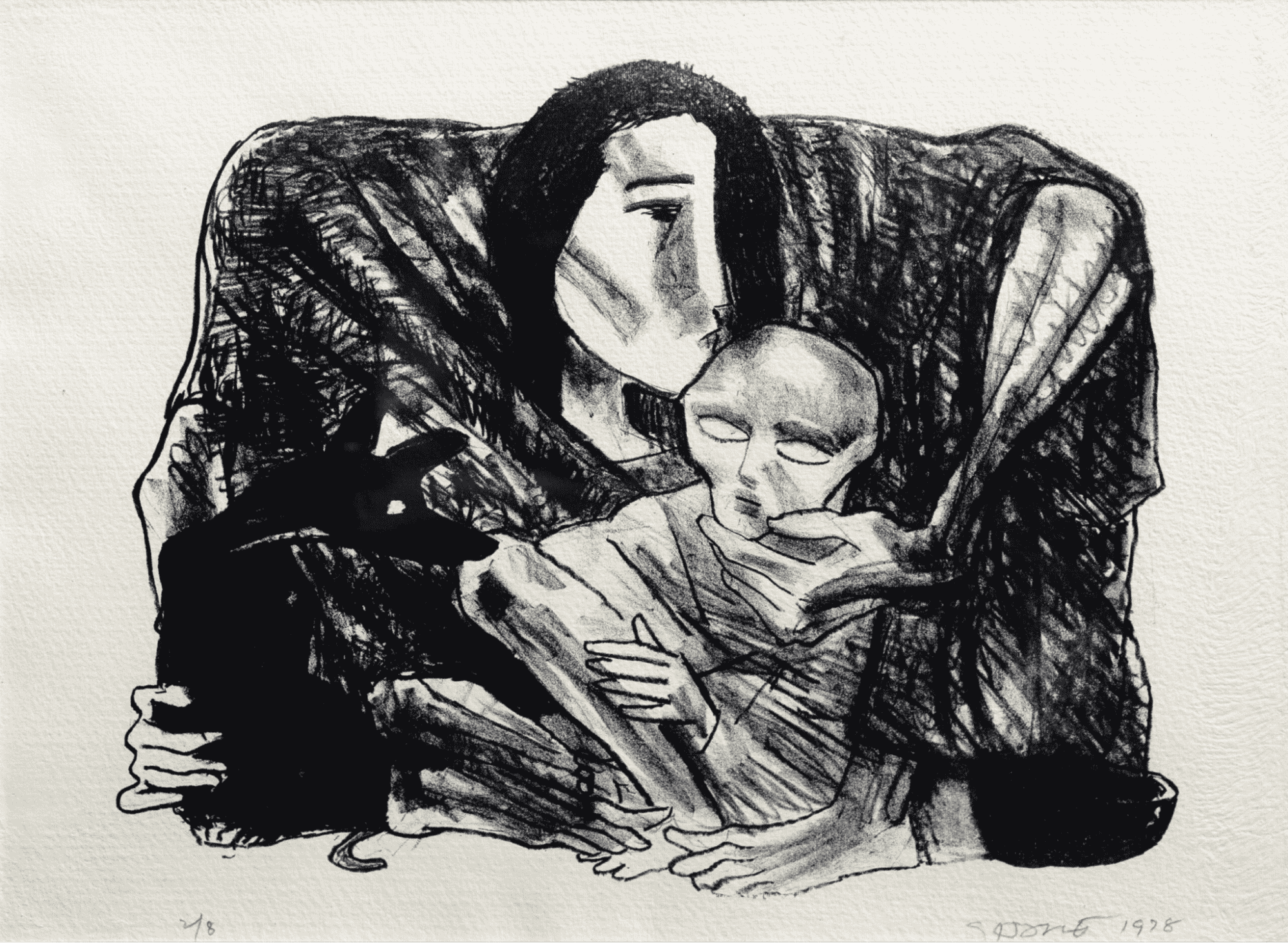
“Art washes from the soul the dust of everyday life.” – Pablo Picasso The wonder of experiencing and engaging with art can feel elusive, even exclusionary. Many imagine it as belonging only to the realm of the select few “in the know,” fluent in the language of art. For […]
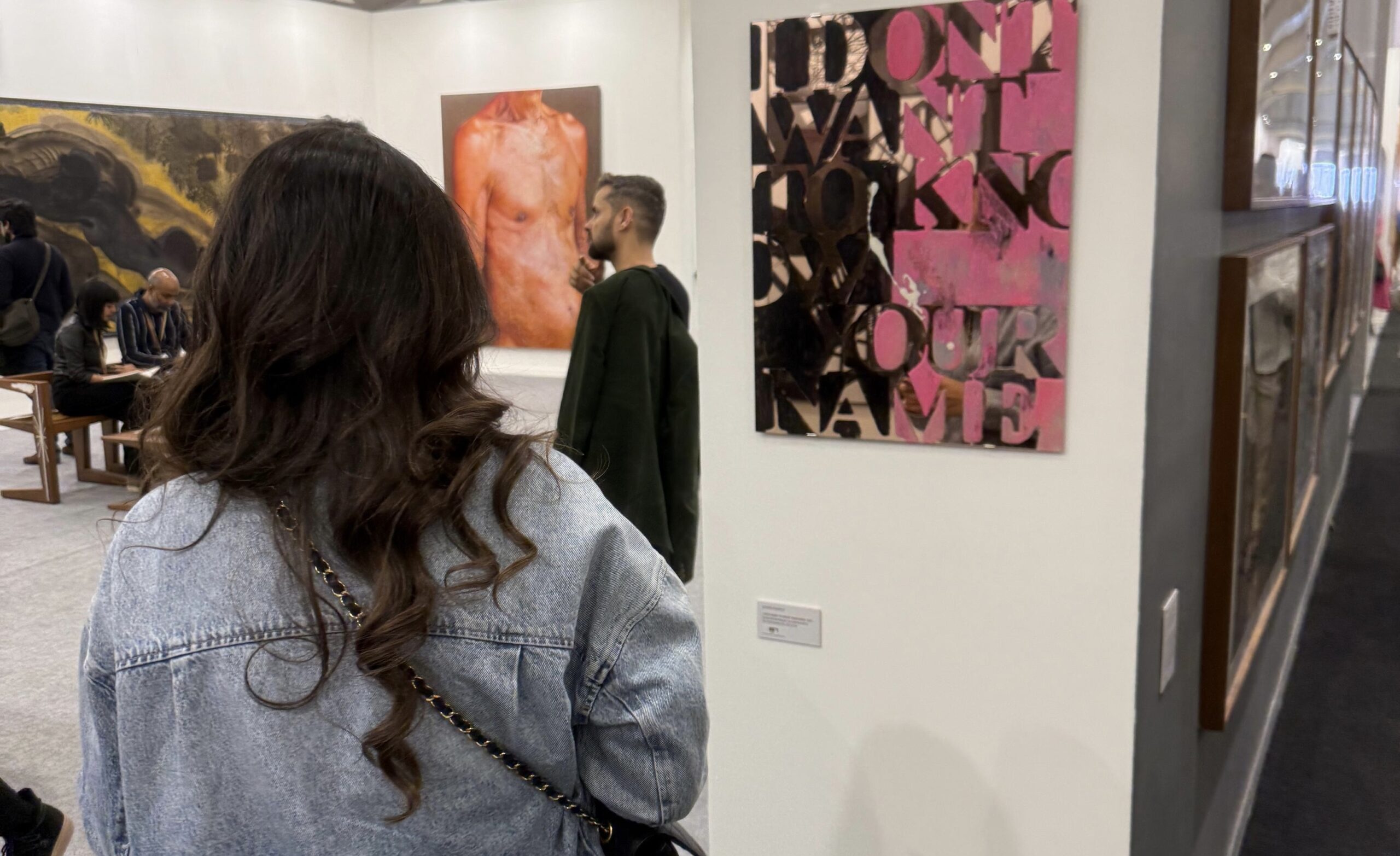
Navigating the art world can be daunting. Prices aren’t always transparent, authenticity can be difficult to confirm, and opportunities often circulate in exclusive circles. For both seasoned collectors and first-time buyers, one question often arises: how do I make the right choices with confidence? This is where an art advisory […]
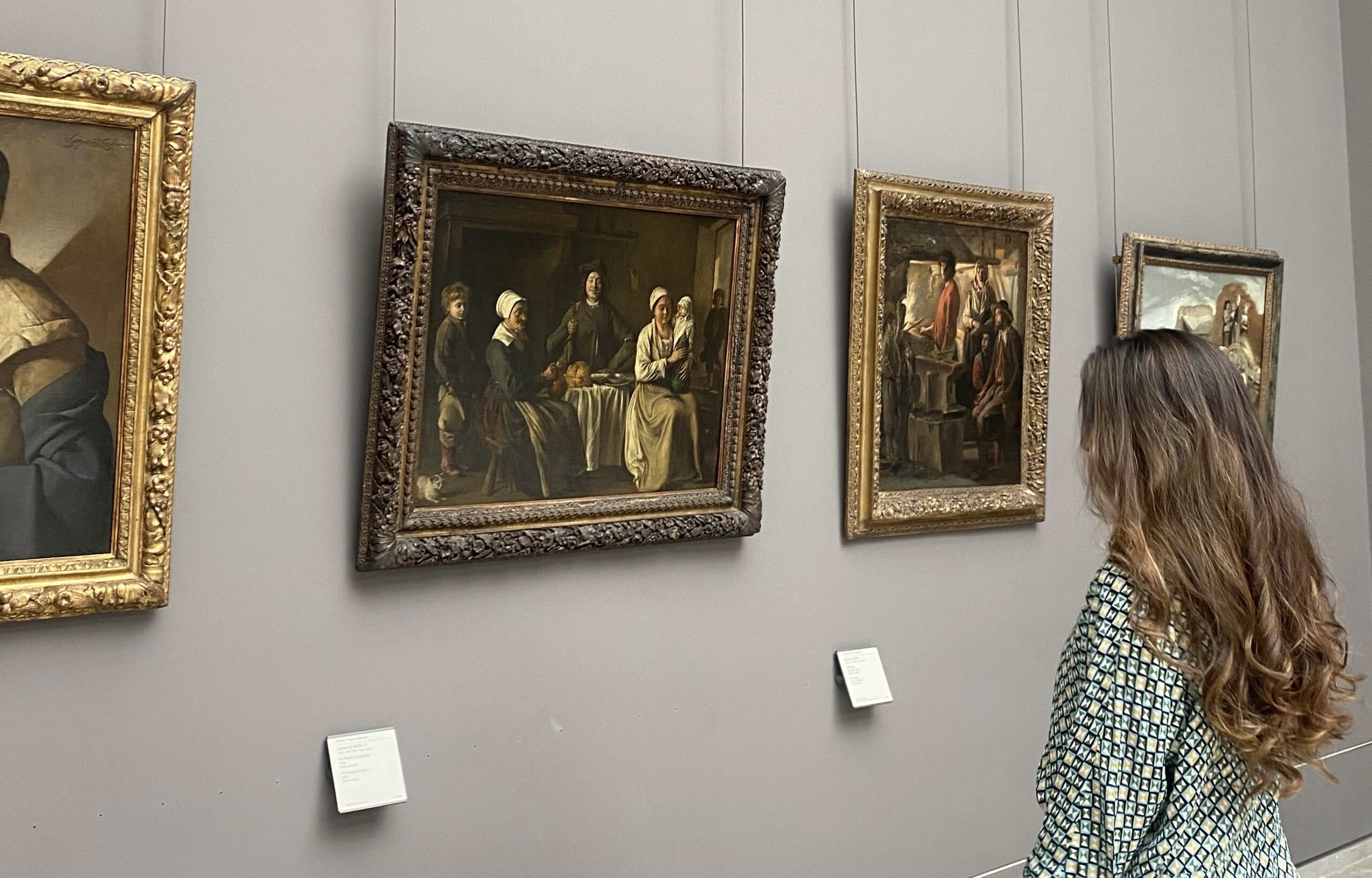
Buying art is an experience that blends passion, curiosity, and investment. For some collectors, it’s about building a meaningful connection with a work that inspires and resonates. For others, it’s about adding a valuable asset to their portfolio that they may appreciate over time. Whatever your motivation, one fact remains […]